

Loero is a brand that produces biologically active substances, vitamins and nutrients for women's beauty and health. Aimed at the Indonesian market.
A key feature of the company is that all nutritional supplements are made from only the finest ingredients, without sacrificing quality, using formulas with scientifically proven effectiveness. All Loero products are guaranteed to be free of GMOs, gluten and pesticides.
It was important to reflect this in the package design and create a visual image that inspires trust and associated with health.
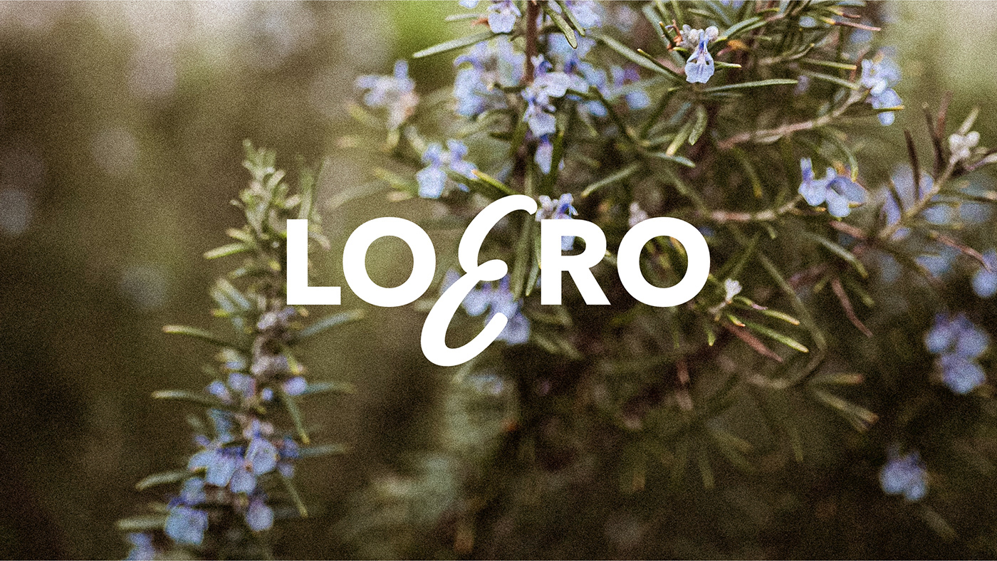
For the logo, we used simple grotesque with accent on the handwritten letter E.
We decided that branding wouldn't be complete without a symbol, and in the packaging it plays its role, helps to develop the corporate identity.

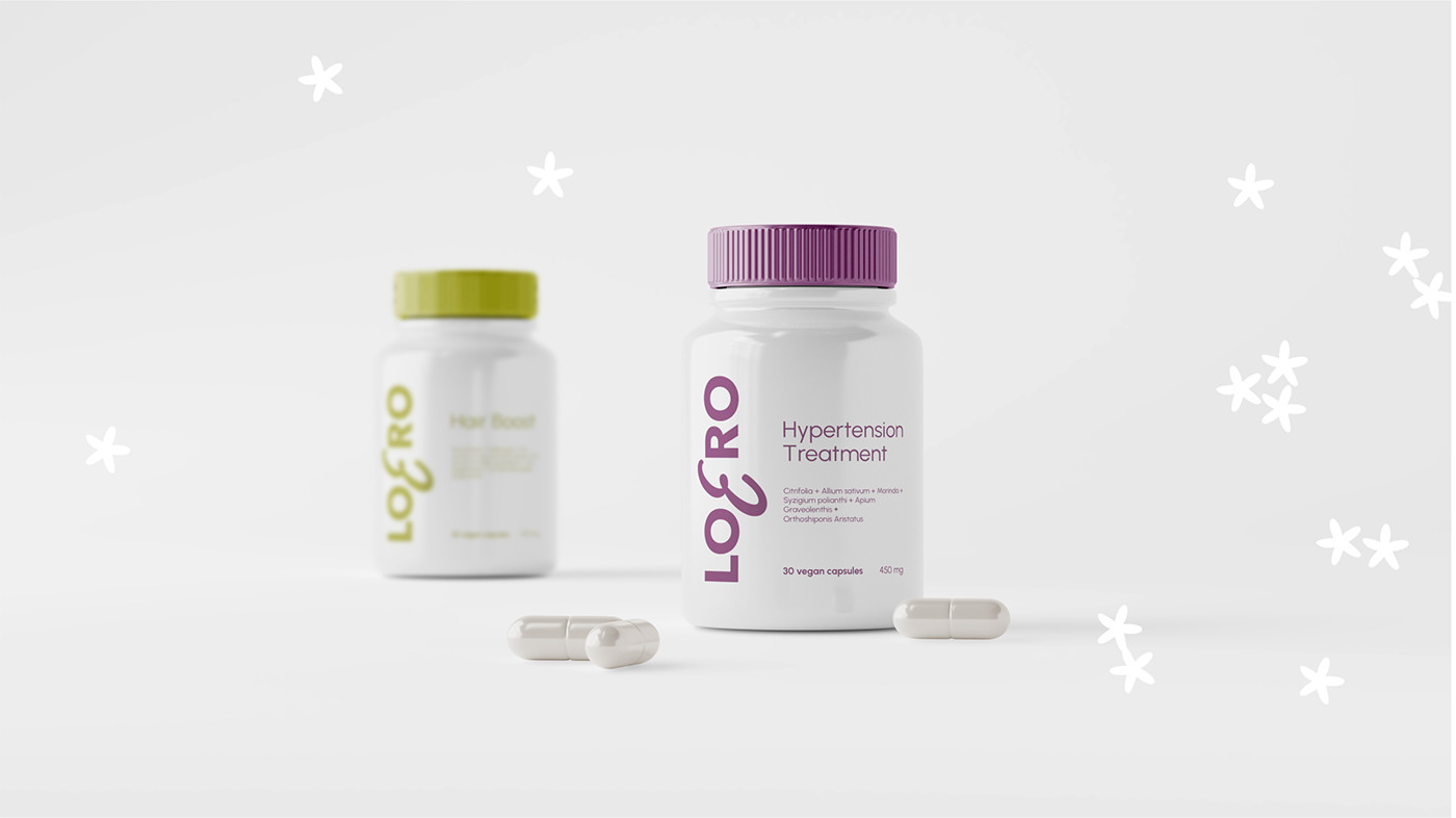
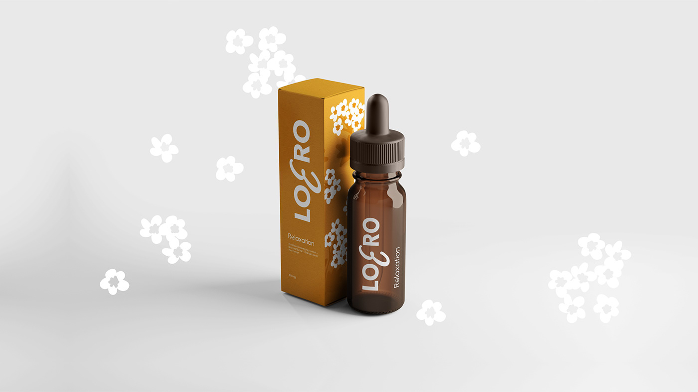
After a long color selection, we've chosen six different shades corresponding to six products and then began working on guidelines.


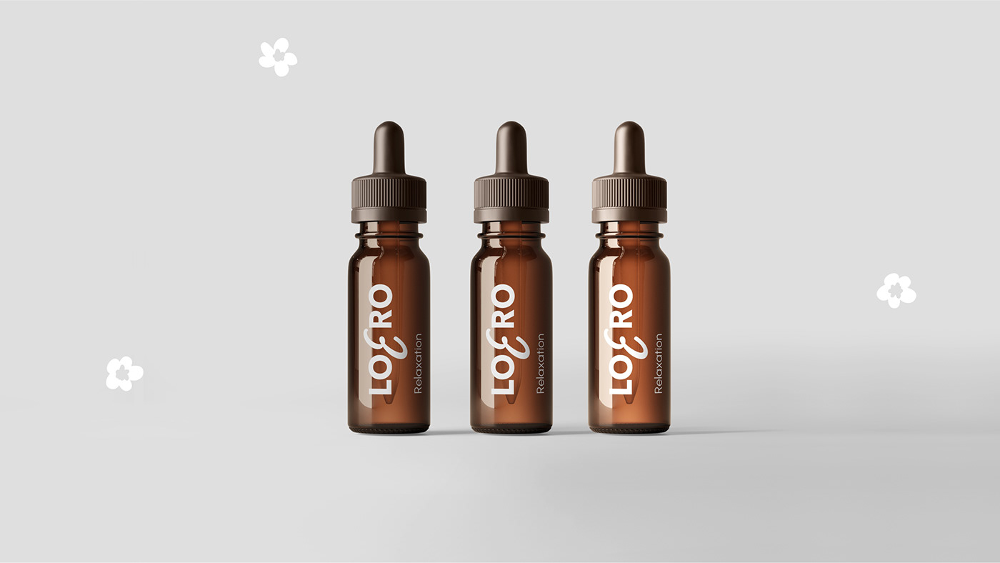
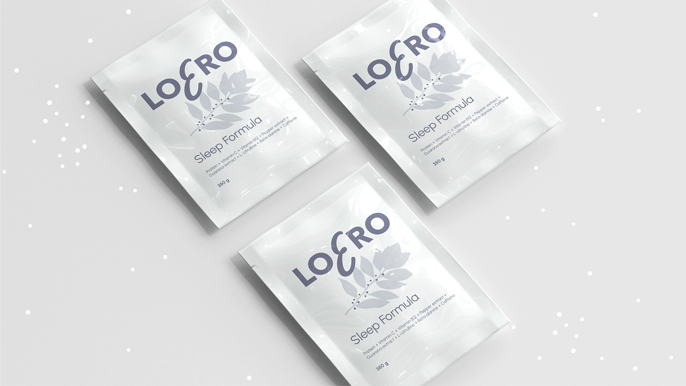
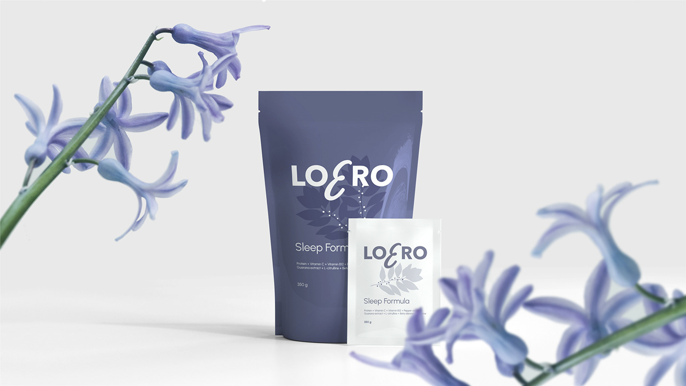
The next step was to create of the product packaging. In total, several types of packaging were developed: boxes, jar, dropper and sachet designs.
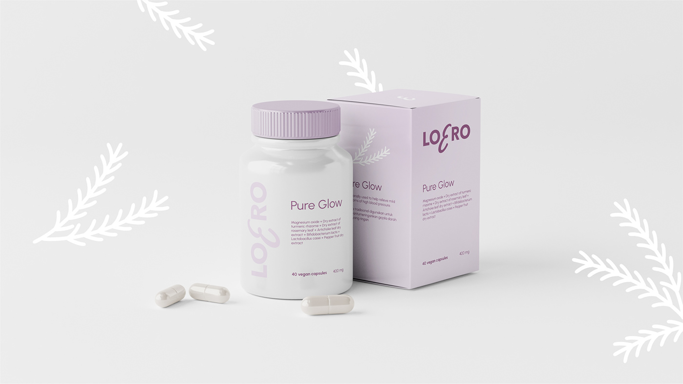
It was important for customer to highlight the ingredients as much as possible, as this is the strength of the product, so we put it on the front side of the package.
Drawn images of the key ingredients placed on the left and right sides of the box.

We also made a package design of a Christmas gift kit.


Thanks for your attention! :)


